Fouroz: Brand Strategy and Identity for a D2C Fashion Brand
Overview
BRAND STRATEGY
BRAND IDENTITY
SOCIAL MEDIA MARKETING
PERFORMANCE MARKETING
Fouroz is a connection wear brand headquartered in Delhi, creating human and companion wear: clothing for men and women, and matching pieces for their dogs. In 2024, GreySpace created its brand strategy and visual identity, then ran its social media, shoots and performance marketing. Today Fouroz sells across India and ships worldwide.
The Brief
Fouroz began as Out of Office Outfits: clothes for the time people spend away from work. We recommended a new name built from its four O's, and Fouroz gave the fashion label room to grow beyond travel wear. By 2024 the founders wanted it to stand for something people could feel: a brand that gathers a community around it, not only a customer base. Before any design or content, that meant answering three questions. What should Fouroz be known for? Who is it really for? And how should it look and sound?
The Insight
We started wide. Our research mapped offline and online fashion retail, the brands its audience looks up to and the labels it competes with. Then we profiled the people Fouroz wants to dress, from a marketing professional in Delhi to an entrepreneur in Bangalore and a consultant in London. They shared one frustration: clothes that blend in. They wanted pieces with character that move easily from a trip to a dinner, and that turn an ordinary day into one worth remembering.
Brand Strategy
So we built Fouroz around exploration. Its purpose treats clothing as a tool for self-expression: helping people embrace what makes them different, move through the world with confidence and create unforgettable moments. Four values guide it: quality, uniqueness, versatility and confidence. Two archetypes shape its character: the Explorer, always looking past the familiar, and the Magician, who makes ordinary moments feel memorable. The voice is refined and encouraging, never loud. One line holds it together: "Wear the Unseen, Live the Unforgettable."
BRAND IDENTITY

Brand Identity
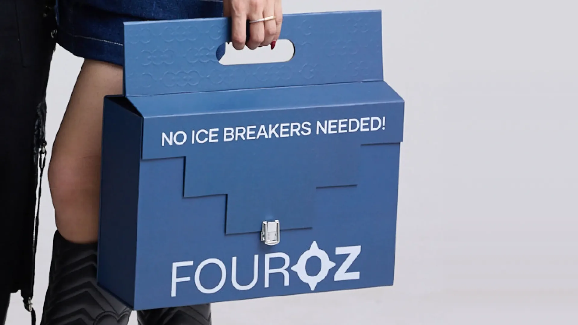
The identity carries that idea onto everything a customer touches. The symbol is four rounded petals, one for each O in Out of Office Outfits, and it works on its own or beside the FOUROZ wordmark. Gilmer is the brand typeface. Indigo and Eerie Black anchor the palette, softened by Champagne Pink, Alabaster and a cool Bright Gray. We applied the system to shopping bags carrying the brand line, swing tags, printed tissue paper, ribbon and stickers, so opening a parcel feels as considered as wearing what is inside.


The Outcome
Fouroz now calls No Ice Breakers Needed both its tagline and its promise, and uses it across its website as #NoIceBreakersNeeded. The fashion brand has since grown into connection wear for people and their dogs, crafted in India, sold across India and shipped worldwide, with plans to grow from India to Dubai and beyond.