Overview
BRAND STRATEGY
BRAND IDENTITY
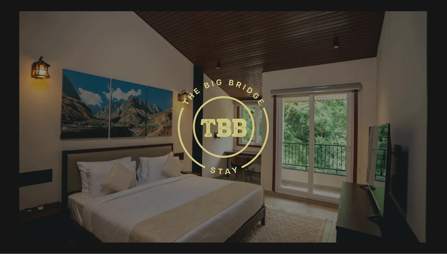
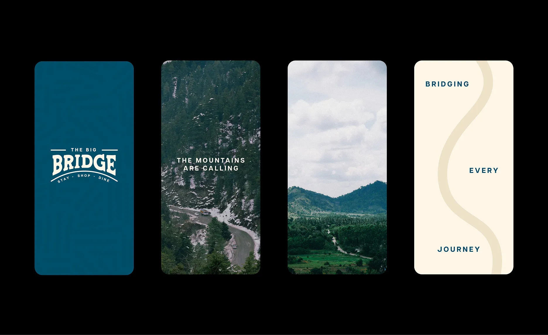
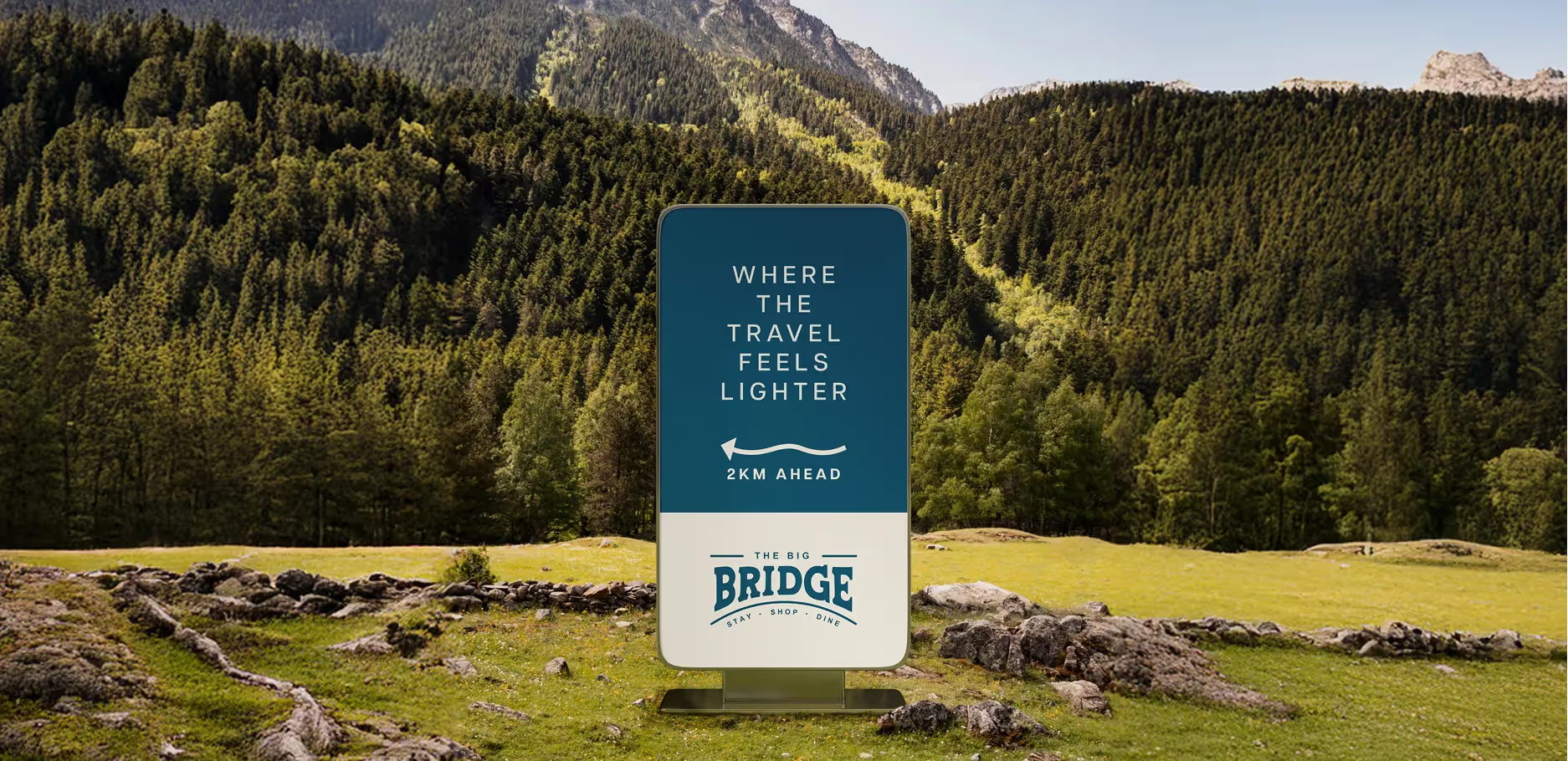
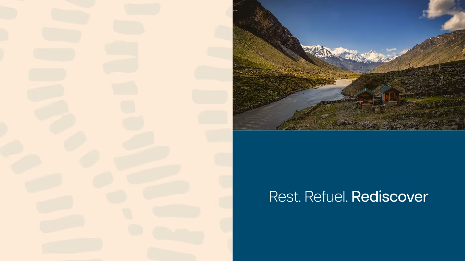
The Big Bridge is a unique property perched on a bridge, offering a water-themed escape where nature and architecture meet. Set along the Ganga, it invites travellers to trek, meditate, or simply unwind in serene surroundings.
Brand Strategy
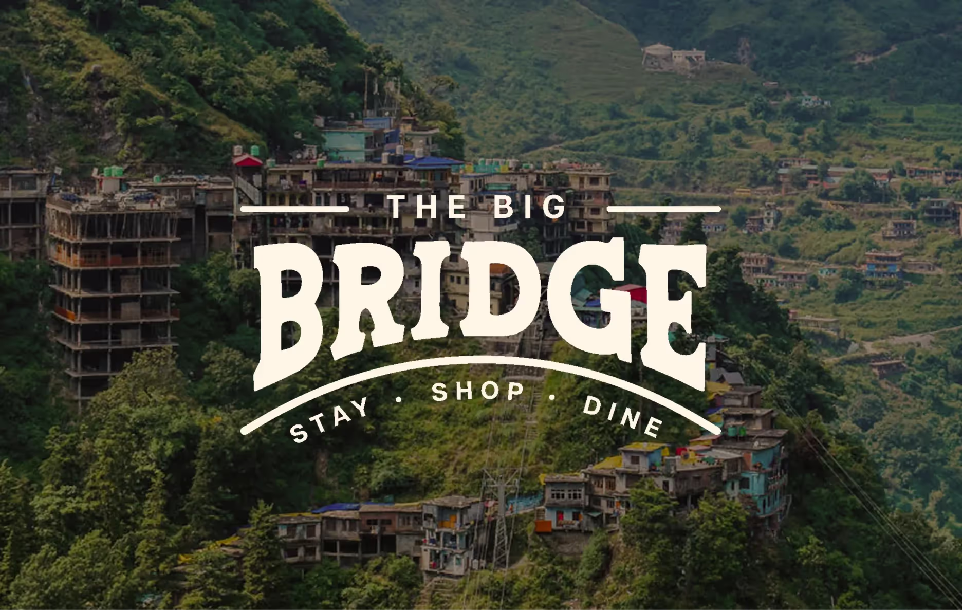
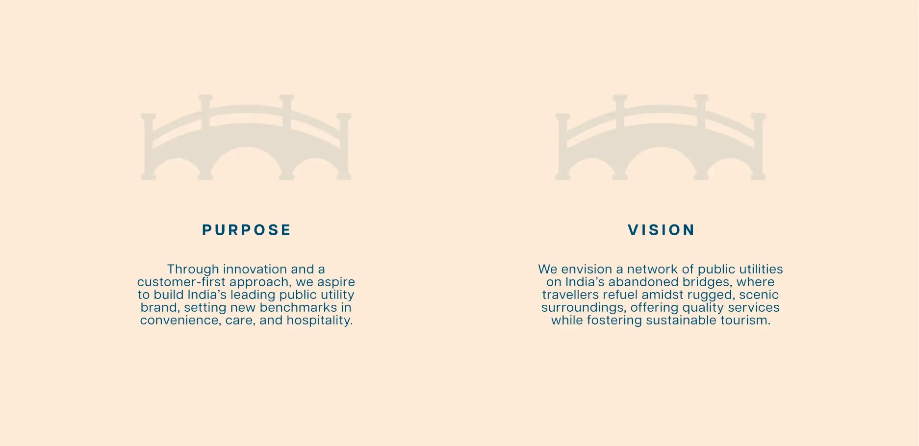
The Bridge Project aimed to transform abandoned bridge structures along India's highways into premium rest stops. Operating in an unorganized industry with no brand precedents, they needed a comprehensive strategy to position themselves as India's first organized public utility brand.
Our brand strategy provided Bridge Project with a clear roadmap for visual identity, communications, and customer experience. By establishing them as the category creator in organized public utilities, we positioned the brand to redefine how road trips are planned across India, removing the stress of finding hygienic rest stops while celebrating the journey.
Our brand strategy provided Bridge Project with a clear roadmap for visual identity, communications, and customer experience. By establishing them as the category creator in organized public utilities, we positioned the brand to redefine how road trips are planned across India, removing the stress of finding hygienic rest stops while celebrating the journey.
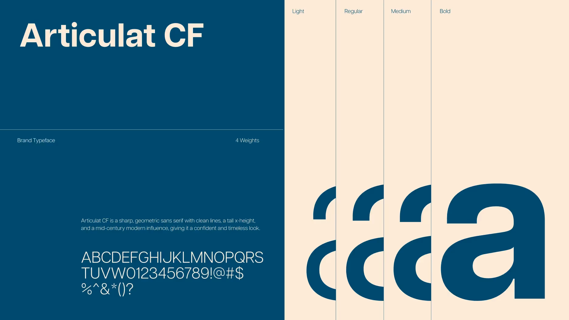
Brand Identity
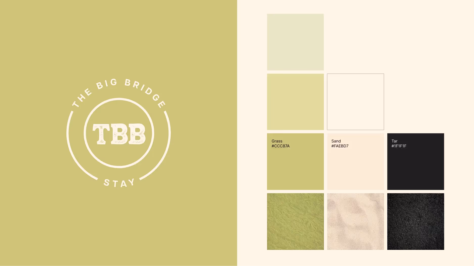
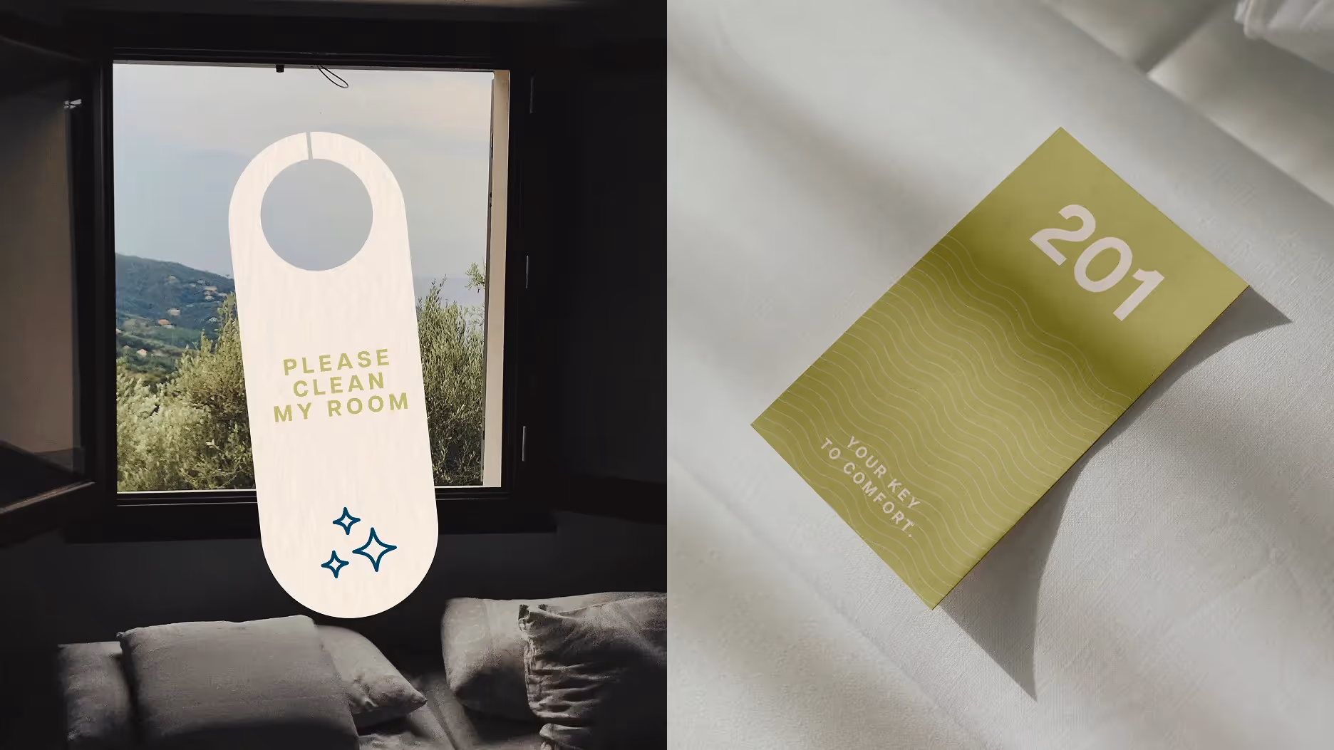
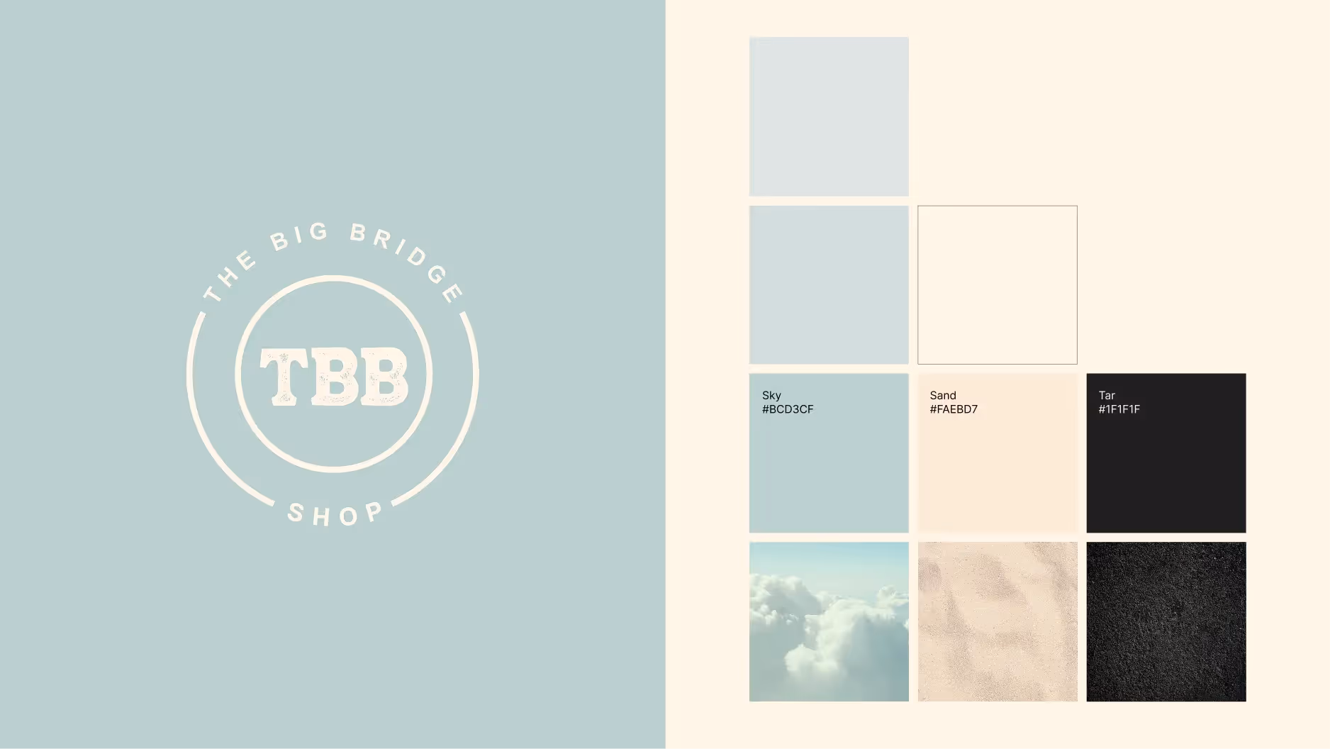
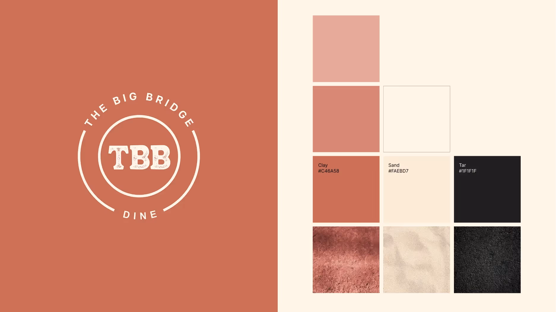
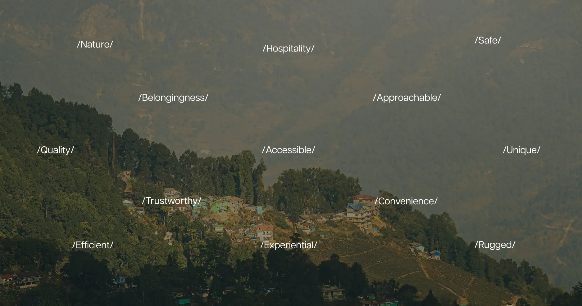
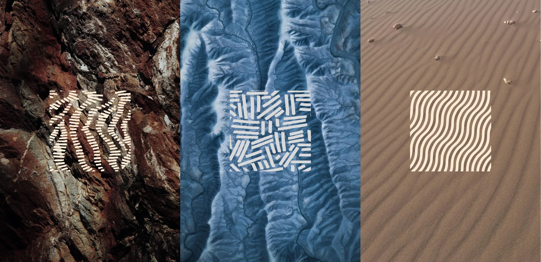
The Identity for The Big Bridge is combines the terrains and palettes of the natural landscapes of Uttarakhand, and the simplicity the brand stands by. The brand textures and colours directly draw inspiration from the rugged mountain rocks, the sand, the vast sky, the thick forests and the lush green fields.

The Three Verticals
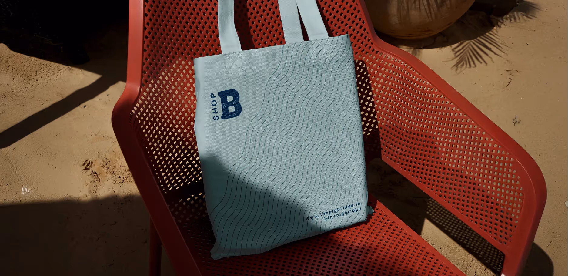
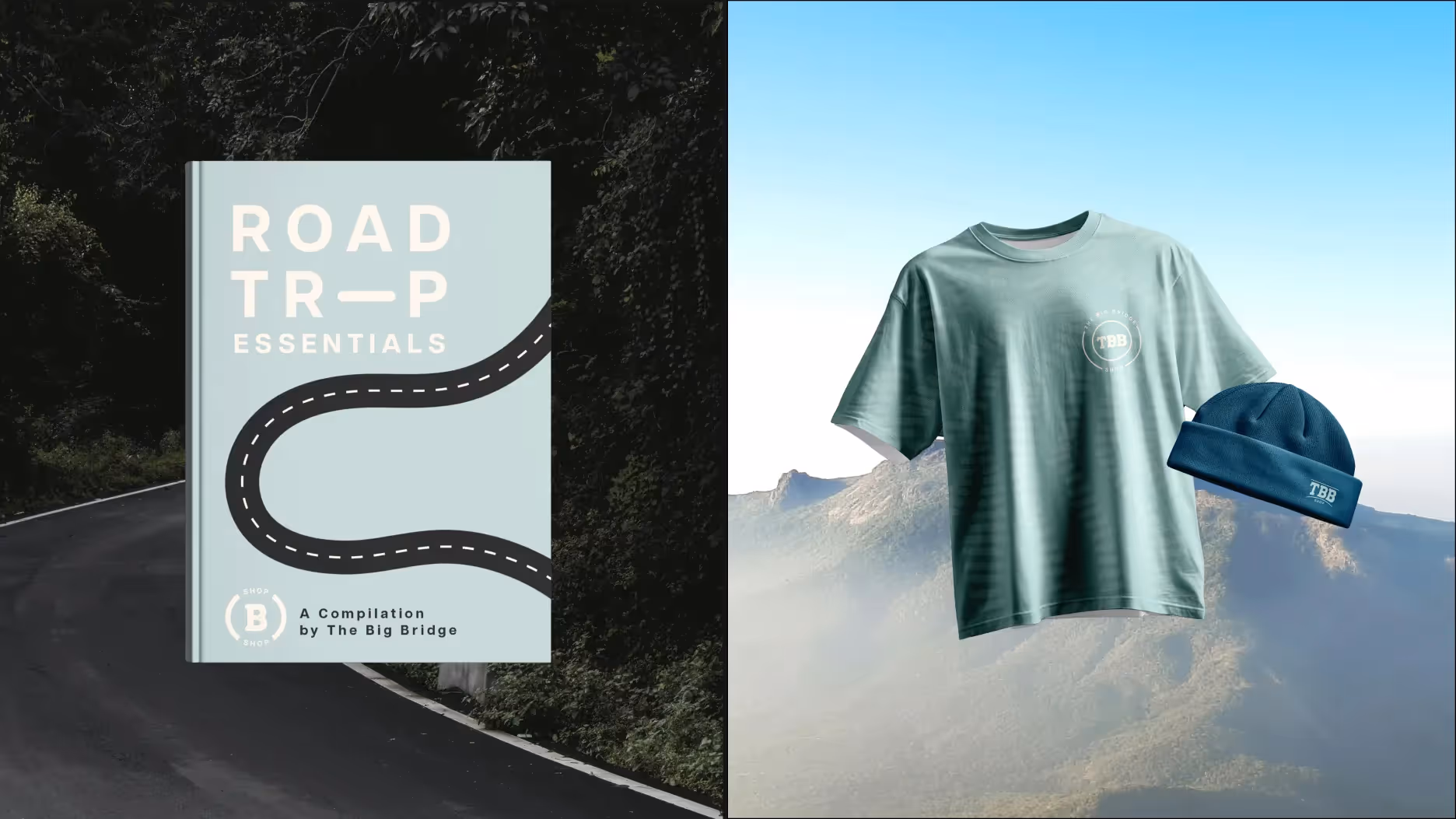
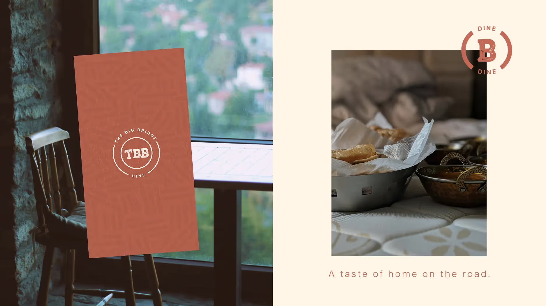
The brand possesses three verticals - Stay, Shop and Dine. Each vertical has its own distinct visual language portrayed through colours and logos to ensure easy identification, while maintaining overall brand cohesion.