Overview
PACKAGING DESIGN
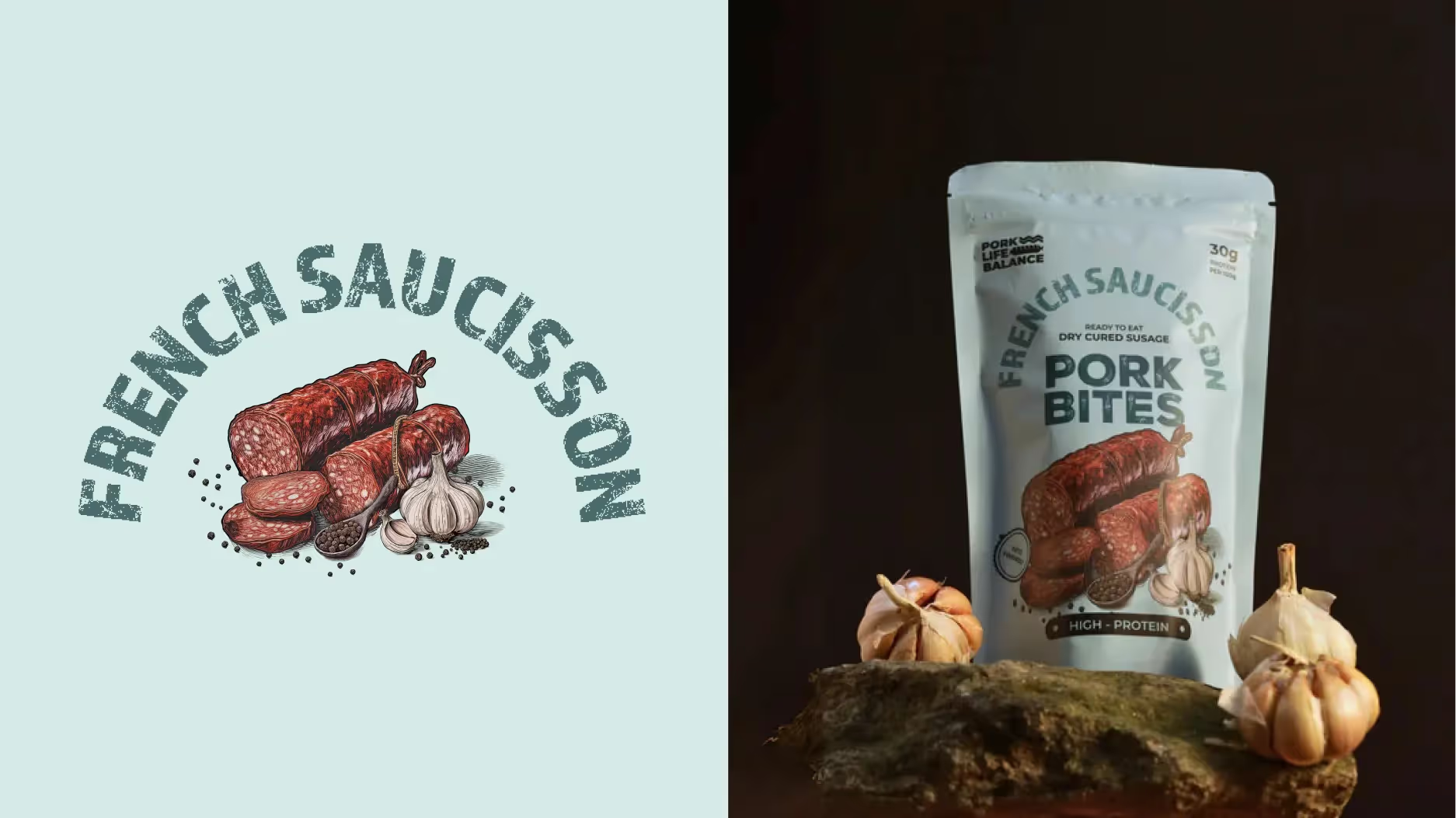
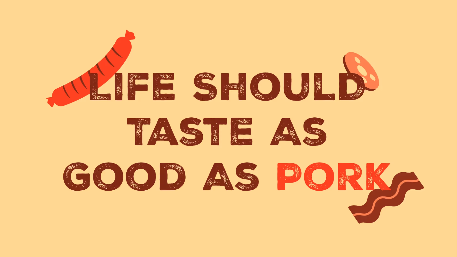
Founded in 2021 by Gaurav, PLB Snacks has carved a niche in the snack industry, specializing in premium, meaty treats. The story begins in 2014 when co-founder Gaurav, during a trip to France, tasted saucisson for the first time. That single bite was transformative, igniting a passion for bold, robust flavors that would eventually become the hallmark of PLB Snacks. Today, PLB Snacks stands out for its rich, savory profiles and distinct crunch, earning its place as a premium player in the snack category.
Brand Identity
Cocktails aren’t just for fancy dinners or late-night parties anymore. Emo Chameo takes authentic, world-class recipes and made them ready to sip anytime, anywhere. Each drink is crafted for a specific mood or moment, so whether you're feeling bold, mellow, or somewhere in between, there’s a cocktail to match.
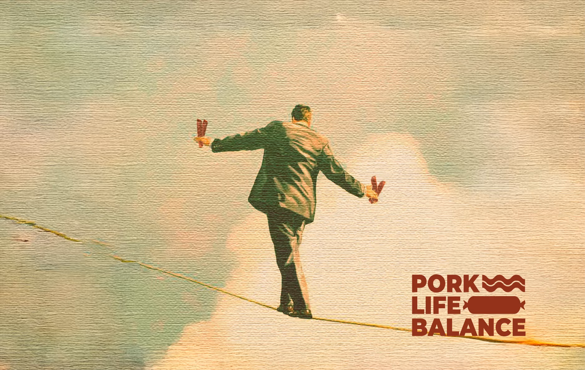
THE PROBLEM
PLB Snacks’ bold flavors deserve packaging that grabs attention. Yet, the original design was muted - overloaded with text and subdued typography that didn’t reflect the excitement inside. Important USPs were buried in the clutter, while illustrations, instead of highlighting unique flavors, blended into one another. To stand out on a crowded shelf, PLB needed packaging that spoke directly to its consumer.
THE GOAL
Our goal was to breathe life into PLB’s packaging, bringing the same vibrancy and punch that the flavors deliver. We envisioned packaging that tells a story with every bite, where each flavor has its own personality and connects with the consumer in an authentic way. The objective was clear: create a design as bold as the snacks themselves.
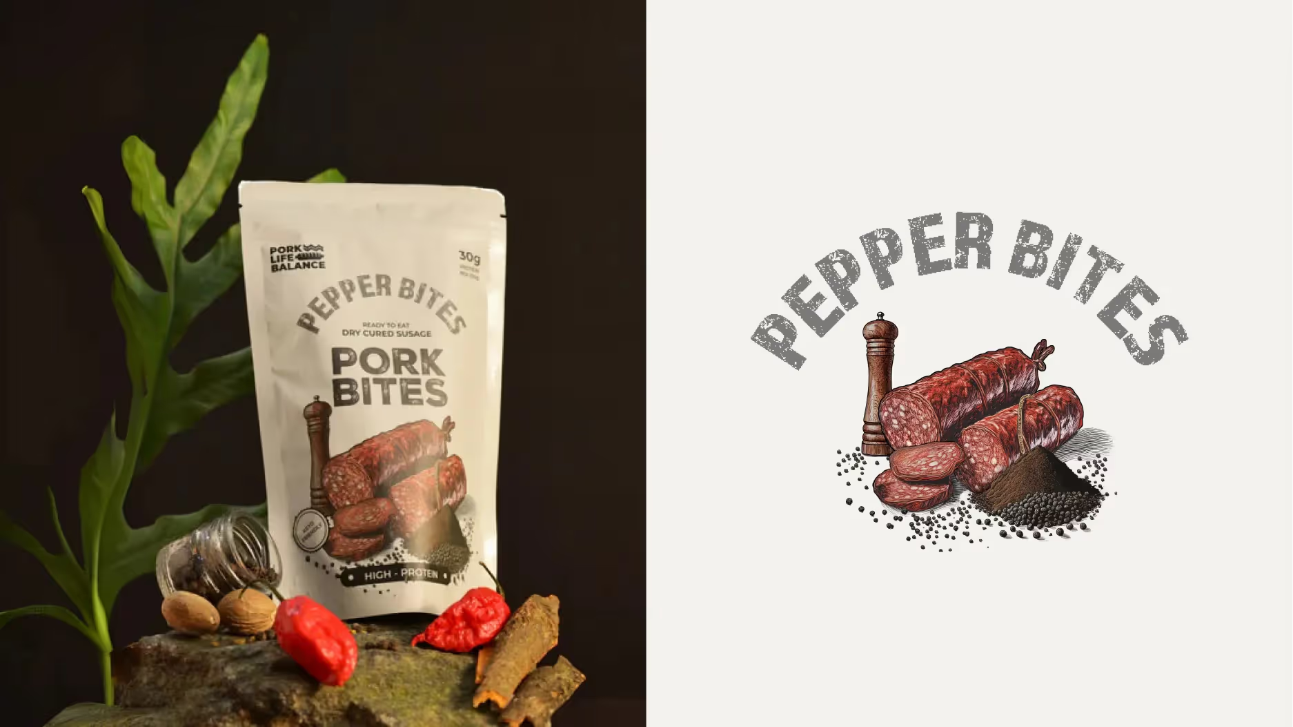
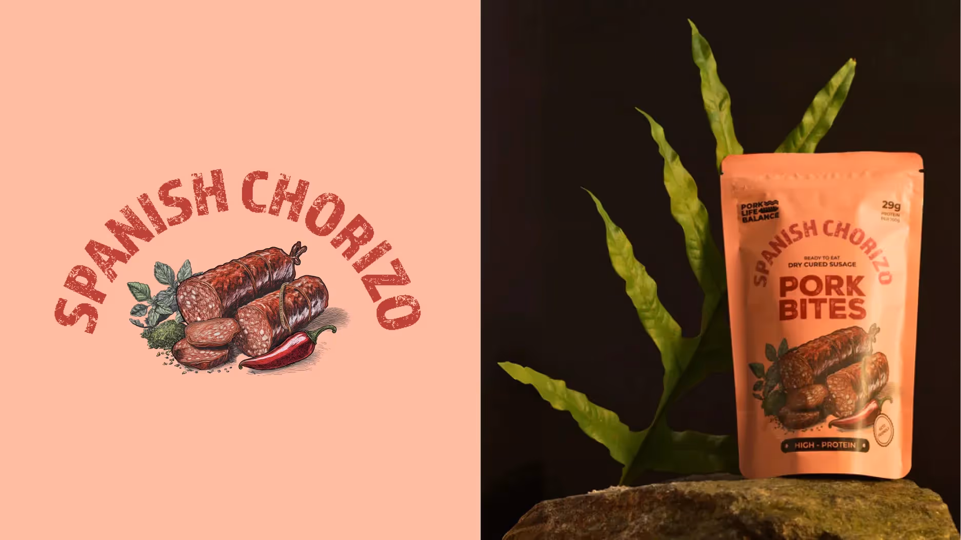
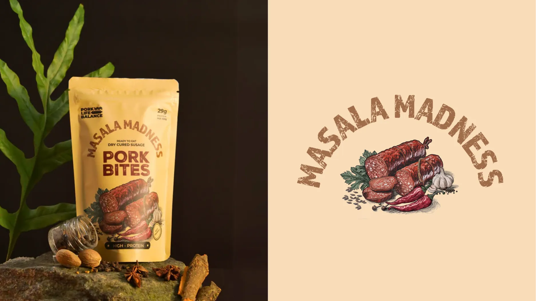
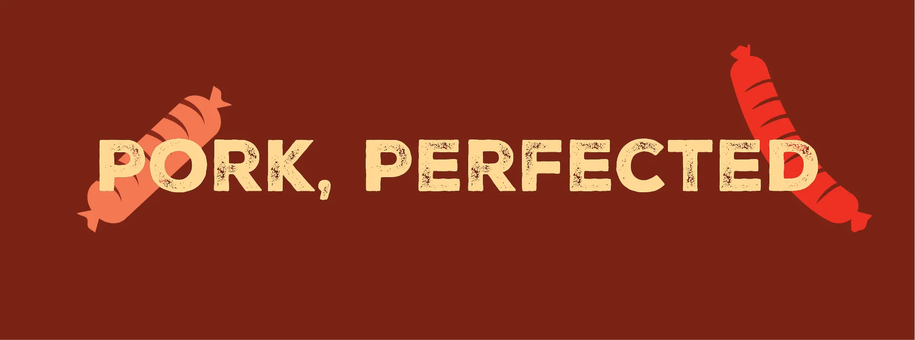
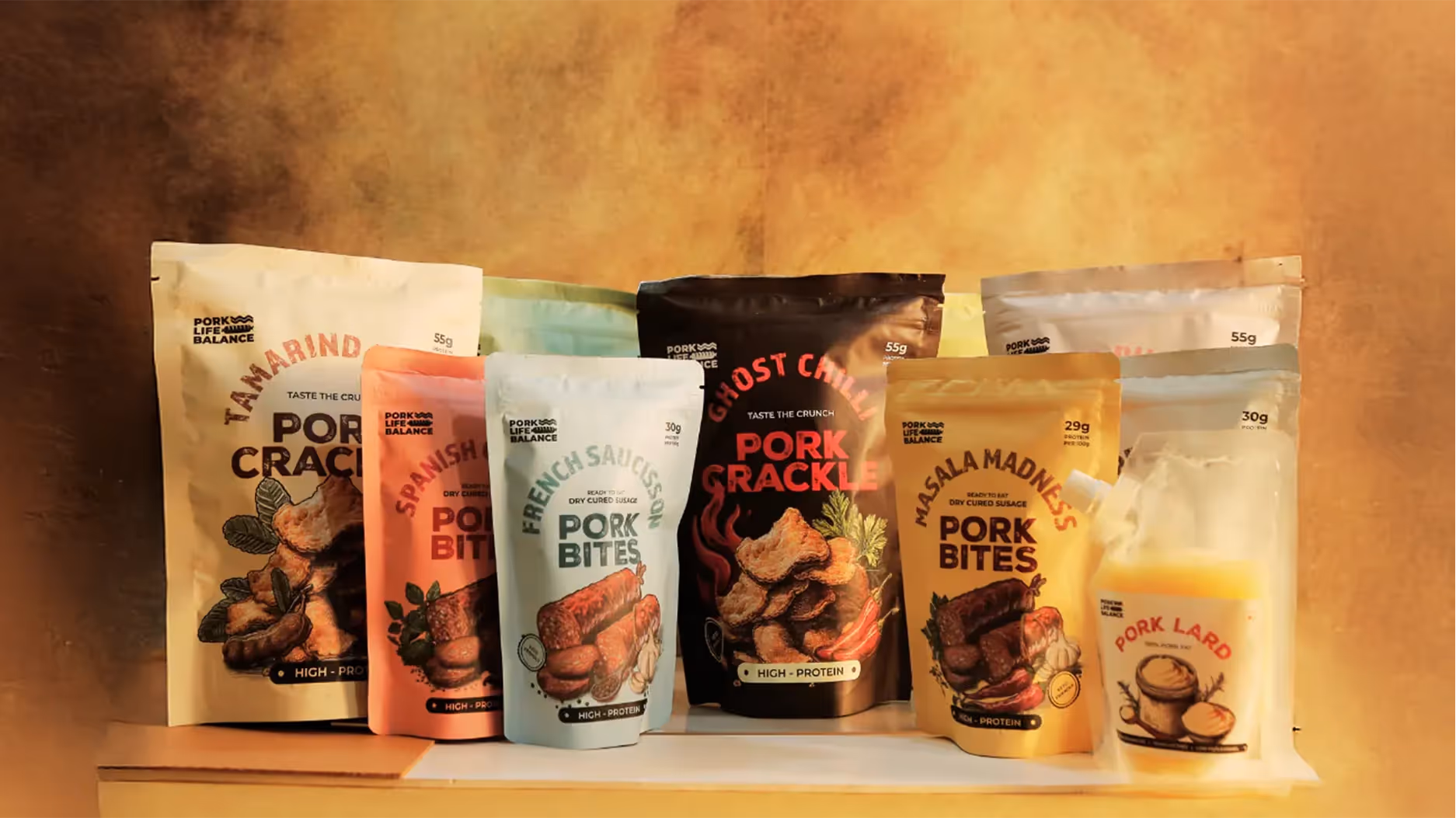
THE SOLUTION
We built PLB’s identity from the ground up, adding clarity, style, and bold flavor to every pack. Dynamic typography reflects its intensity, while a clean back highlights key USPs. Distinct illustrations define each flavor, making the range easy to explore. The result: PLB Snacks now stands out with confidence, capturing its adventurous spirit and inviting discovery in every crunch.