Overview
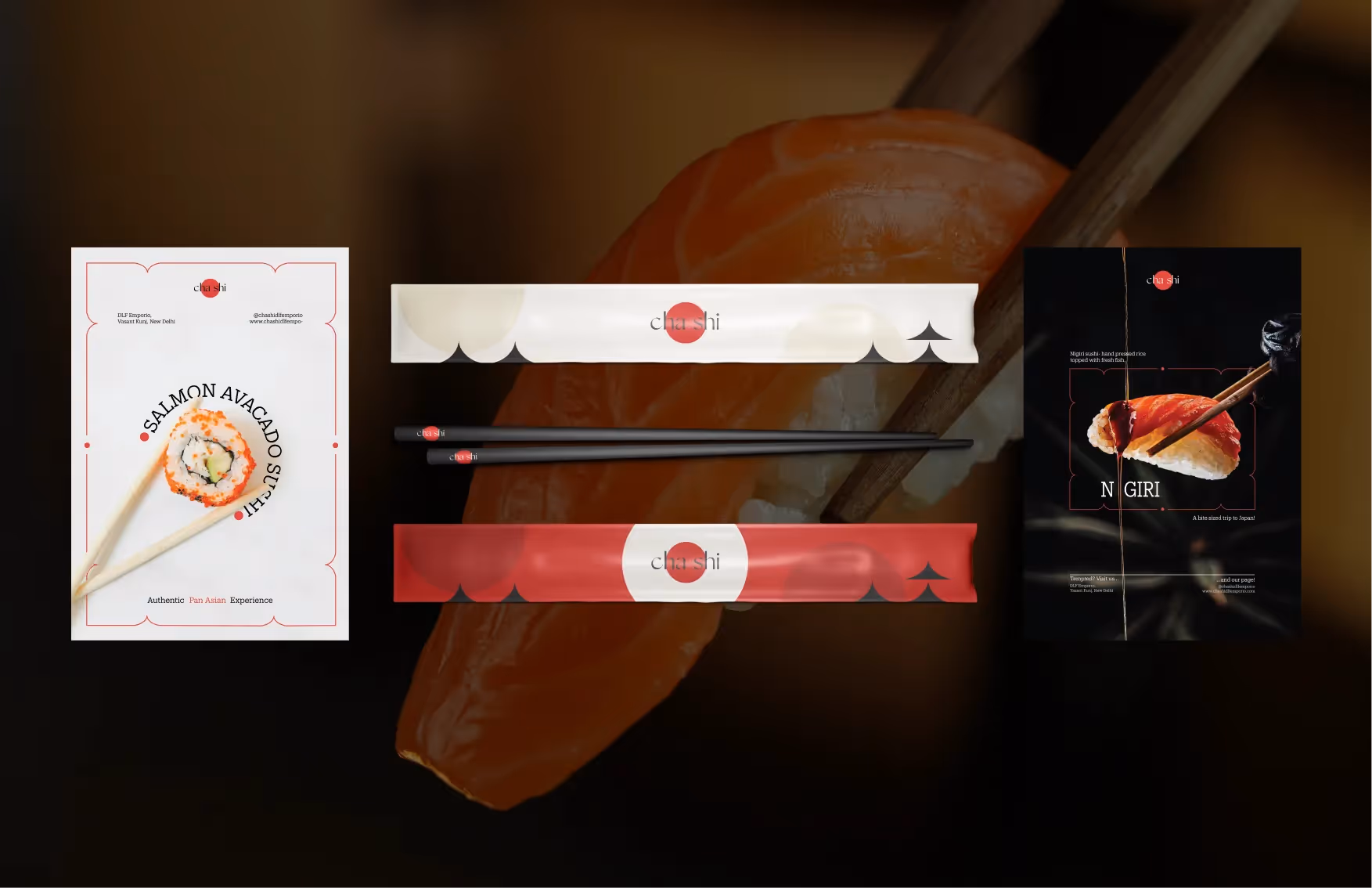
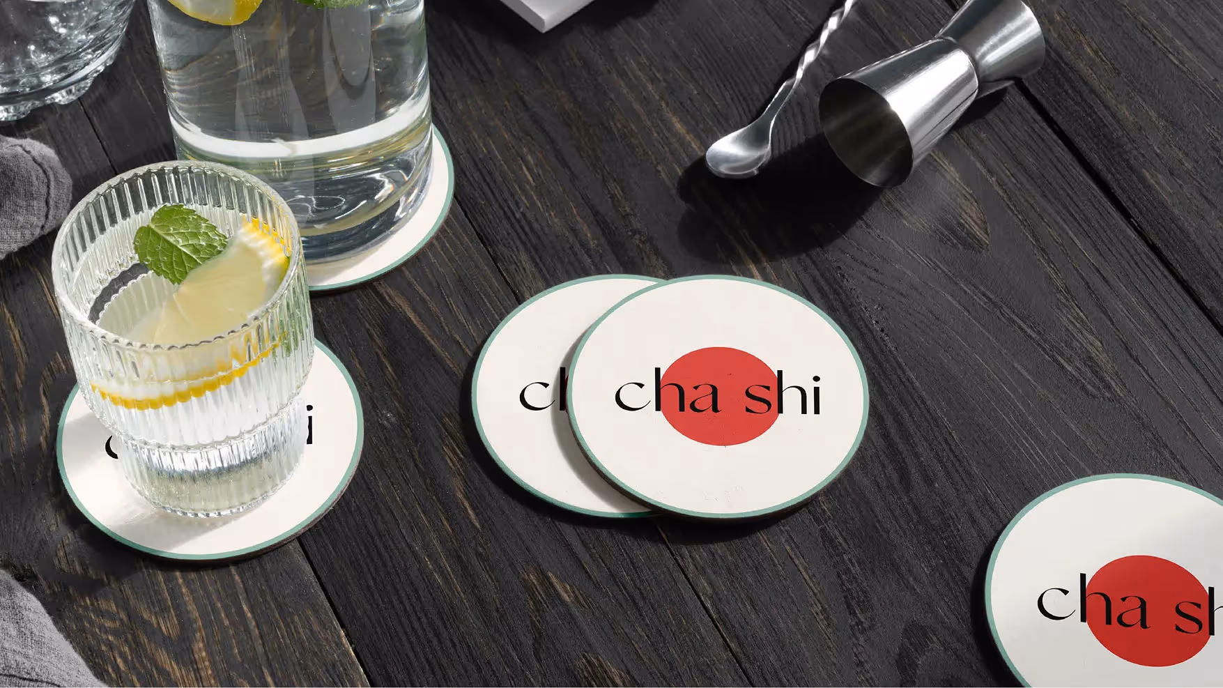
BRAND IDENTITY
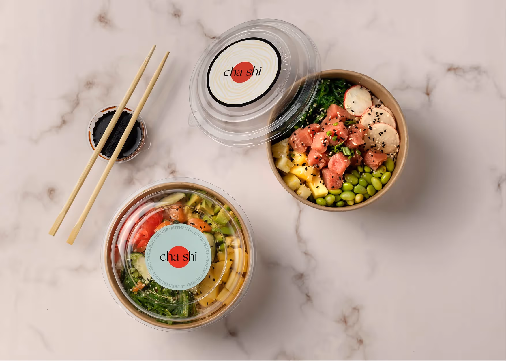
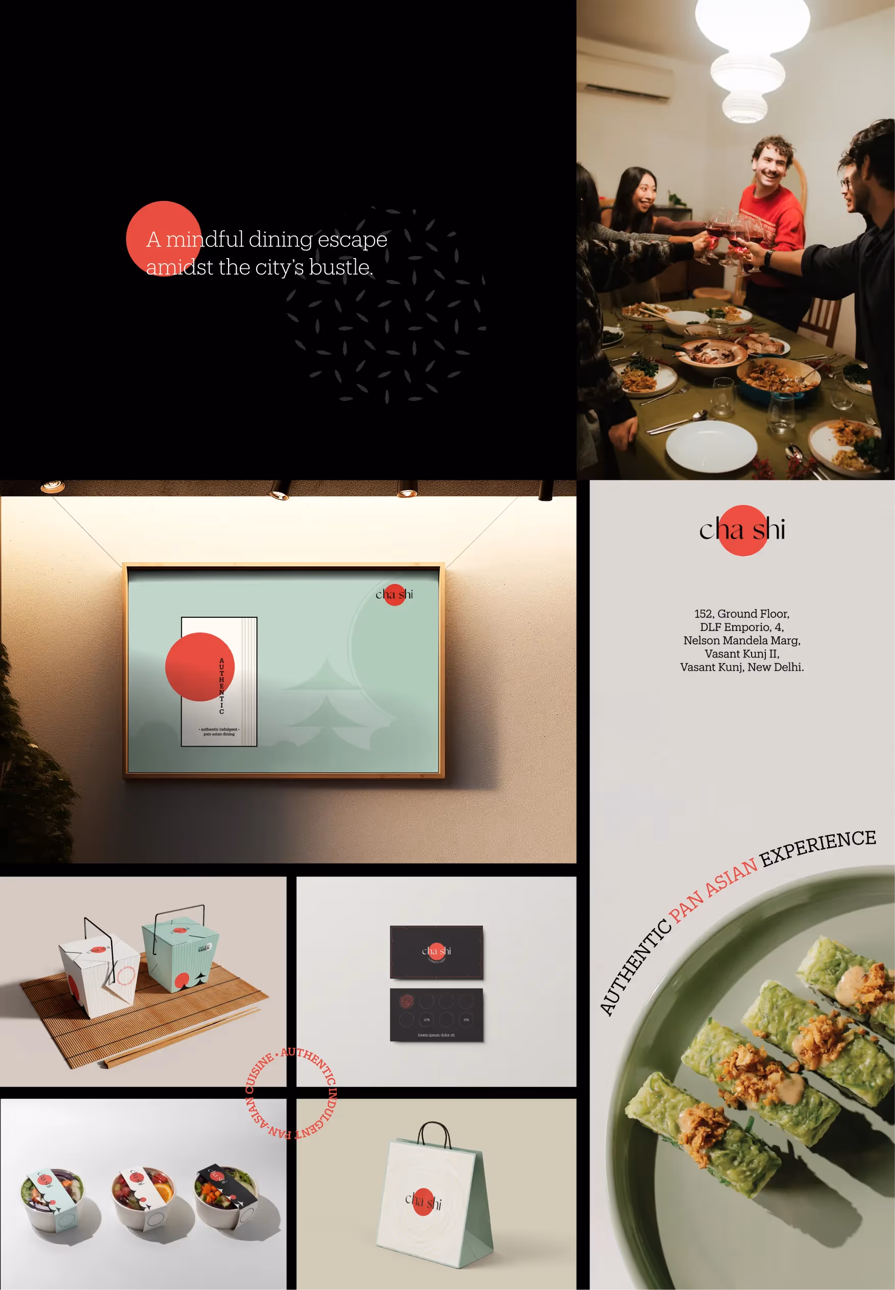
BRAND COLLATERALS
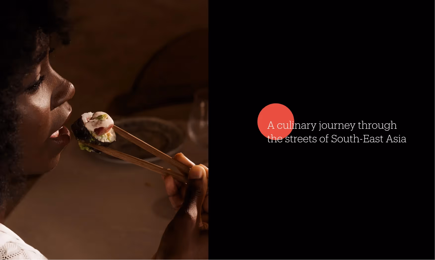
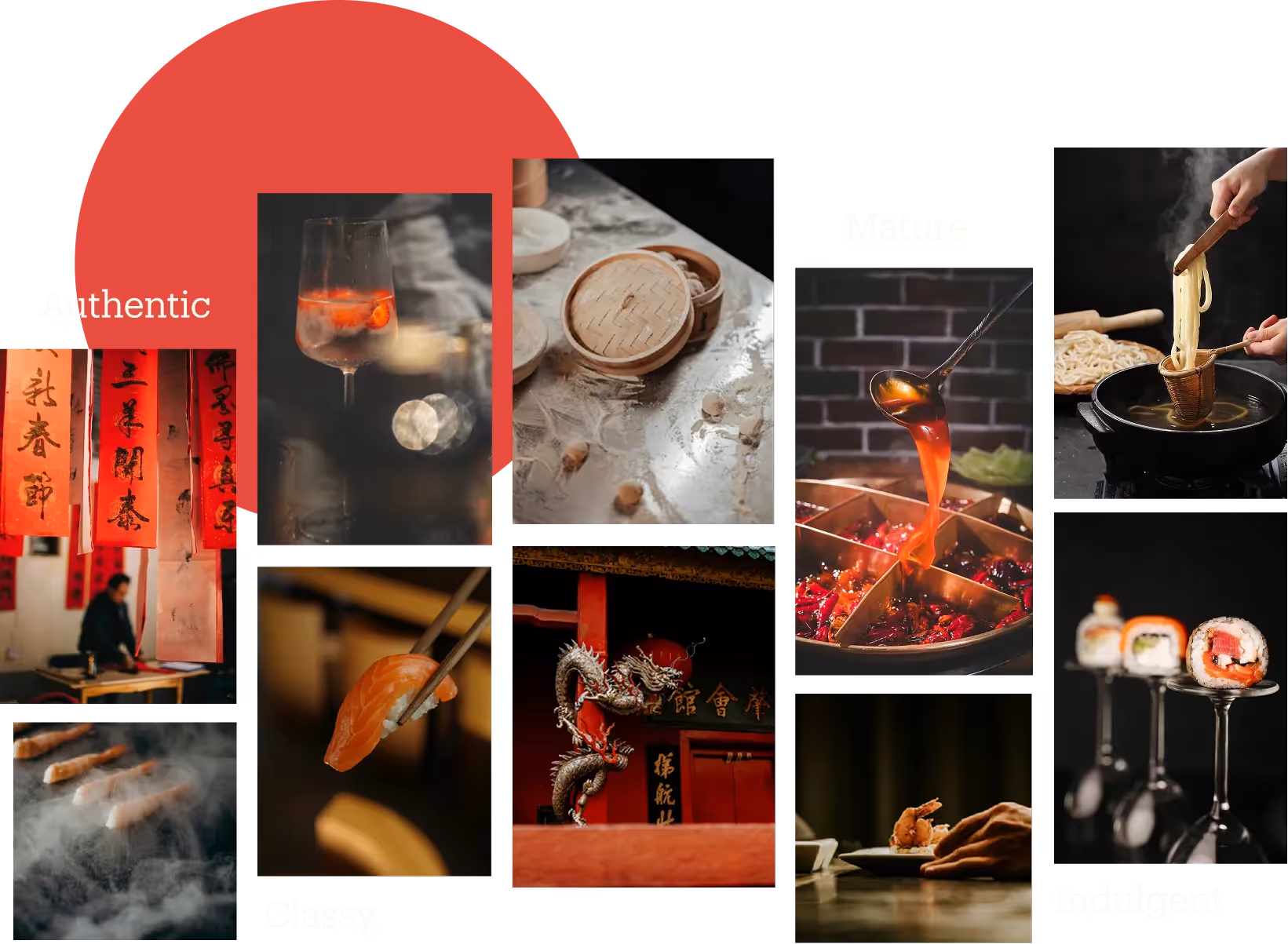
Nestled amidst the vibrant pulse office buildings, commercial hubs, and IT centres, Cha Shi beckons you into a world where culinary indulgence meets mindful dining. Cha Shi not just a restaurant; it’s are a culinary sanctuary, a Pan-Asian café and bar celebrating the vibrant spirit of street hawkers, offering a smart-casual, all-day dining experience like no other.
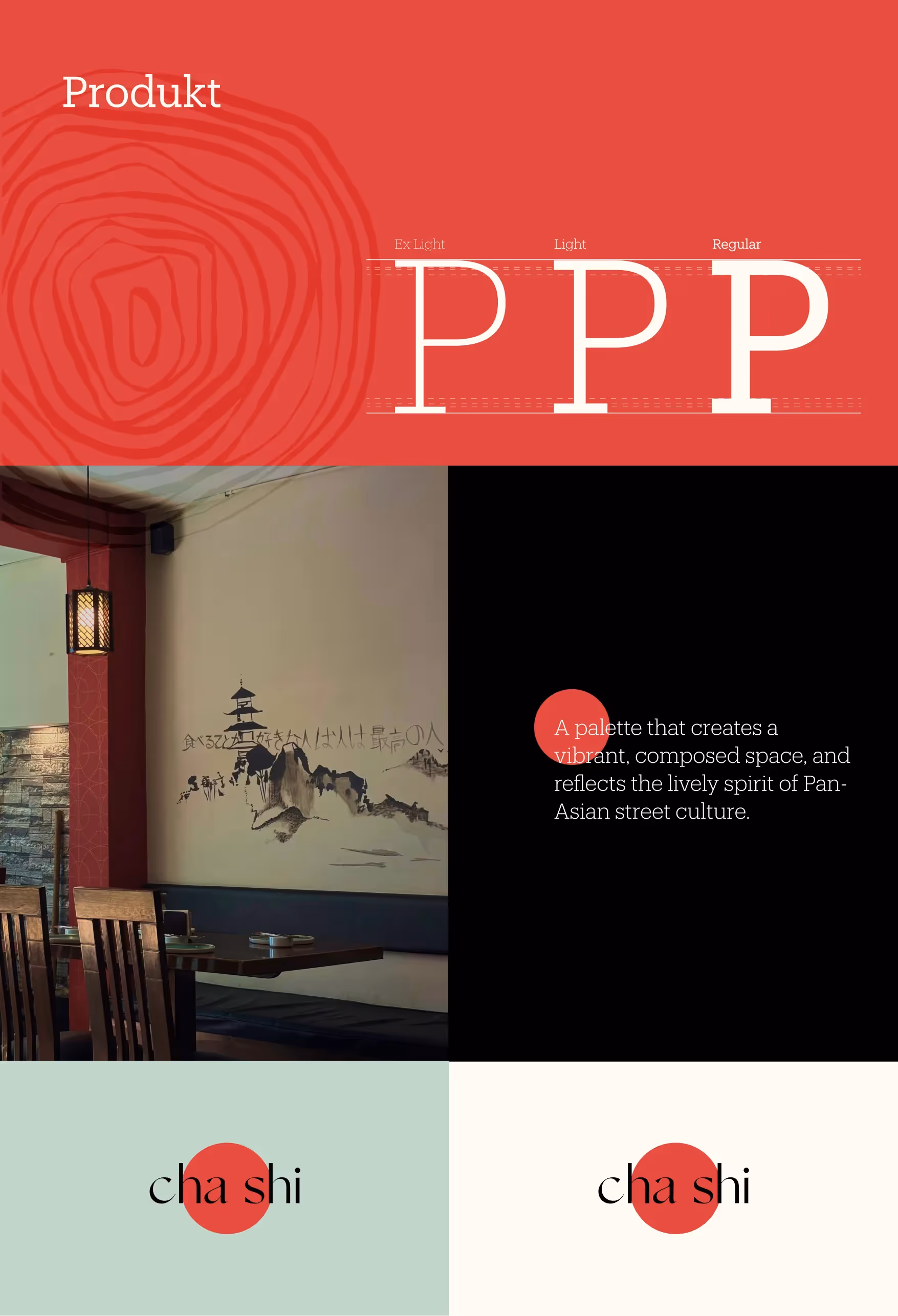
Brand Identity
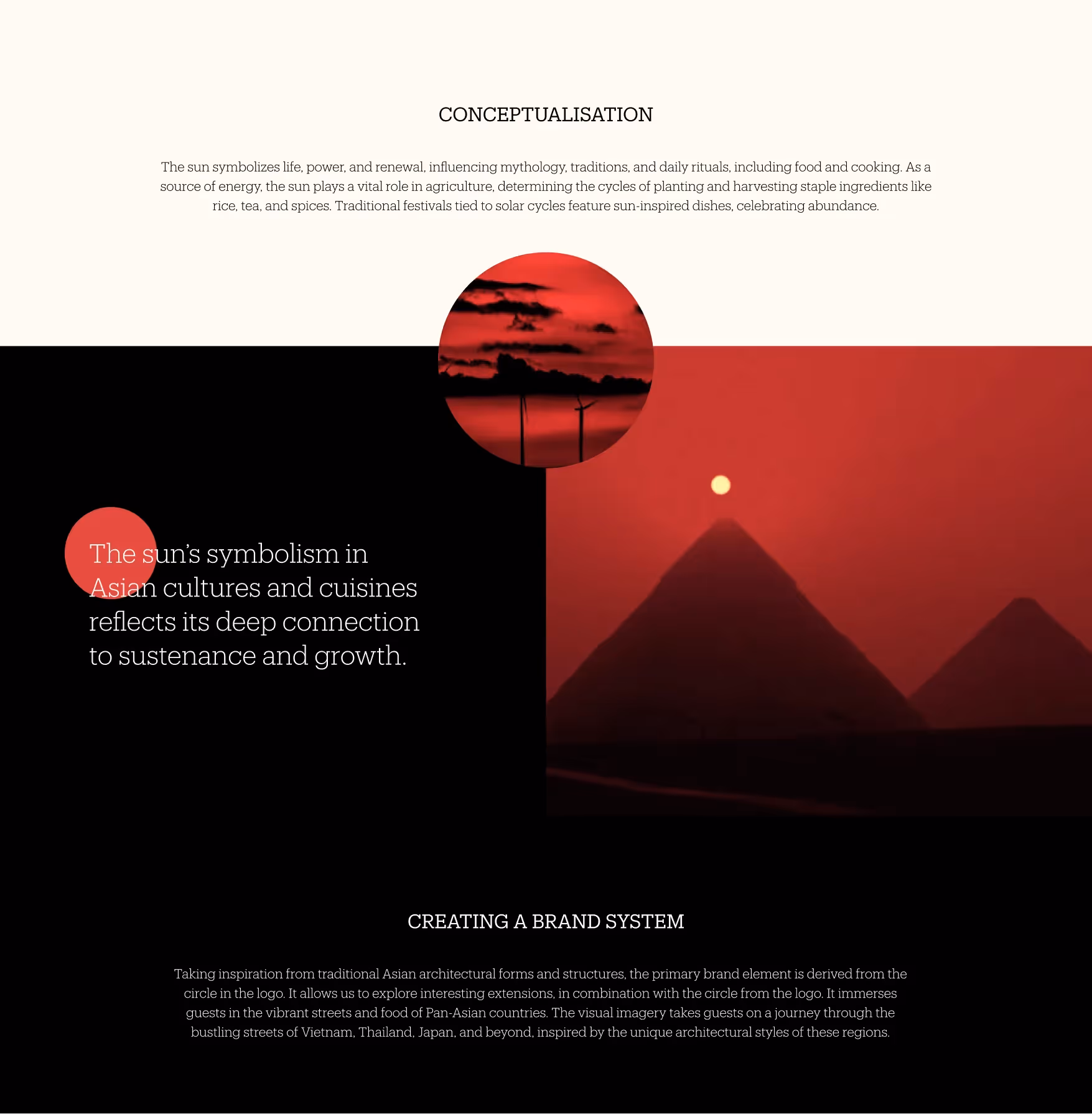
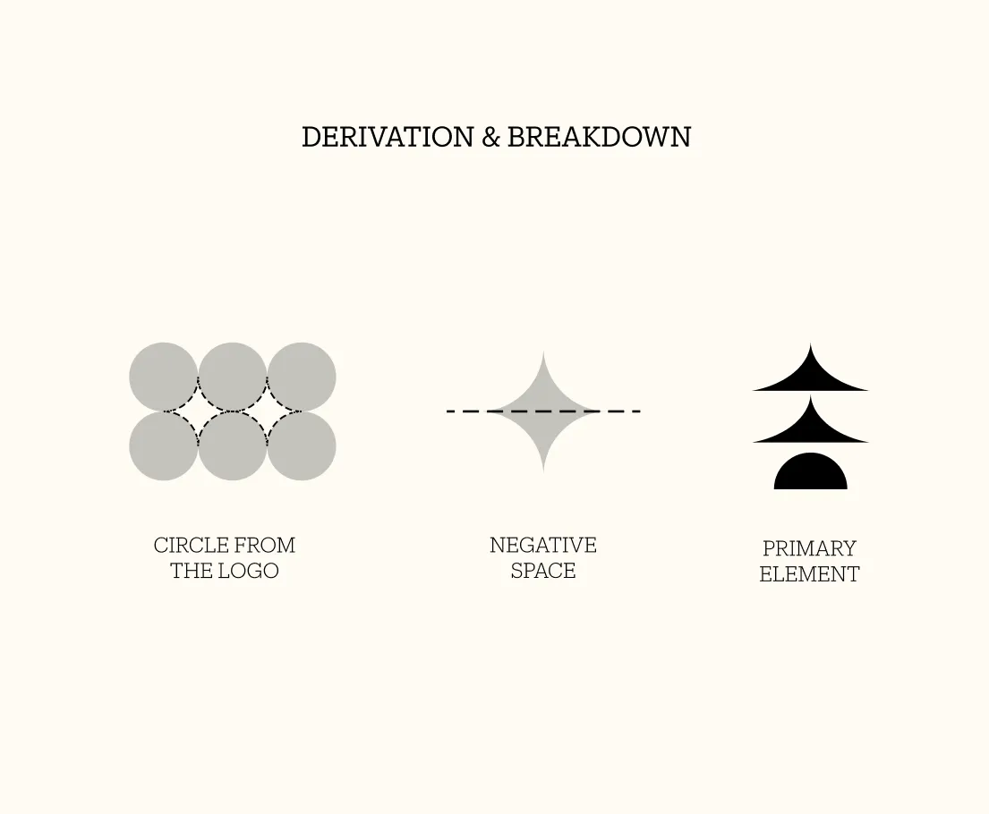
The identity for Cha Shi primarily takes inspiration from the sun, which has immense significance across Asian cultures and the unique yet similar architecture that these cultures share. The sun in the logo is represented using a circle in the colour red - a colour that holds cultural and spiritual significance. The red circle is paired with the type, with the brand name, “Cha Shi”, in a typeface that brings out the cultural value, but also retains the elegance and modernity of the brand.